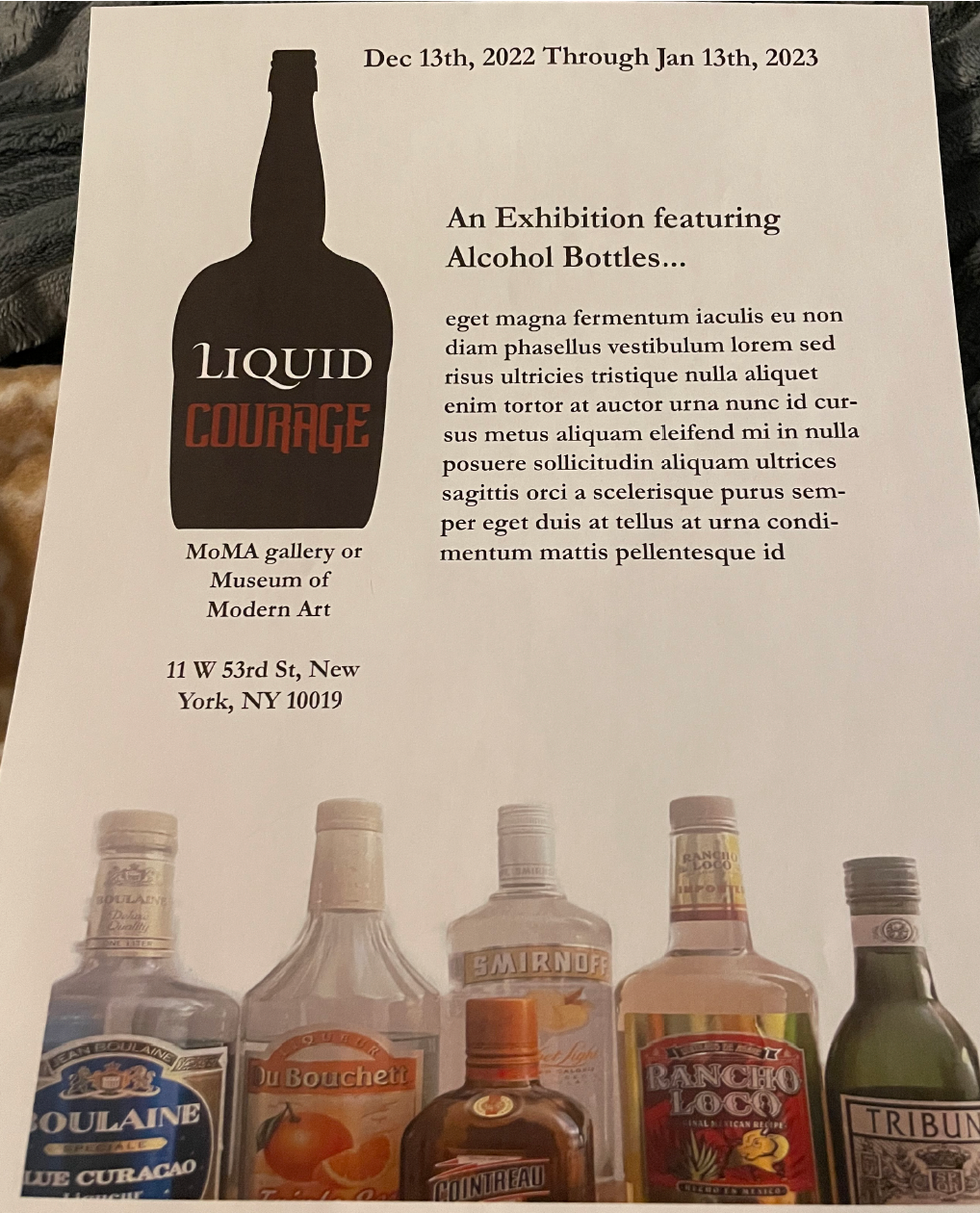
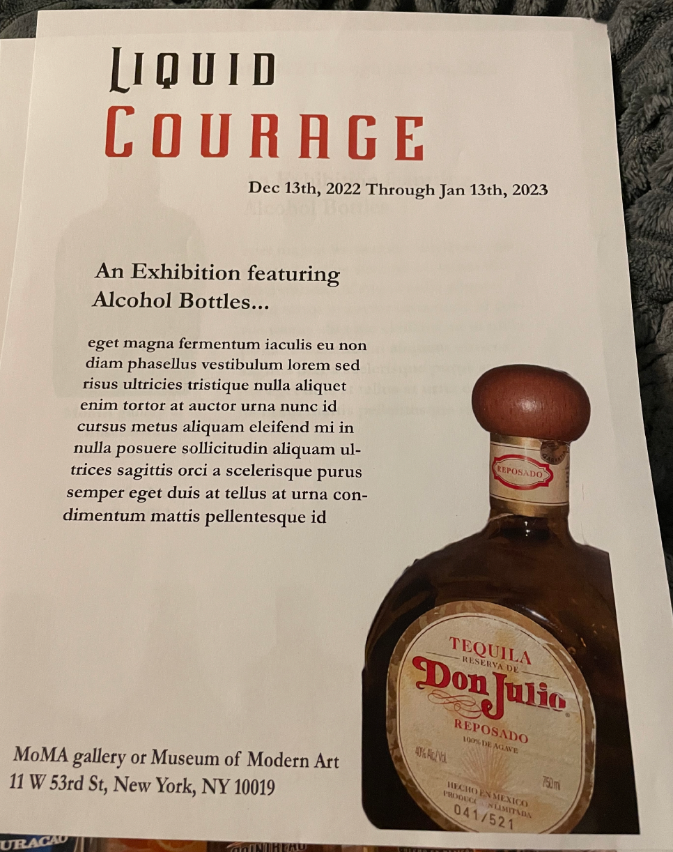
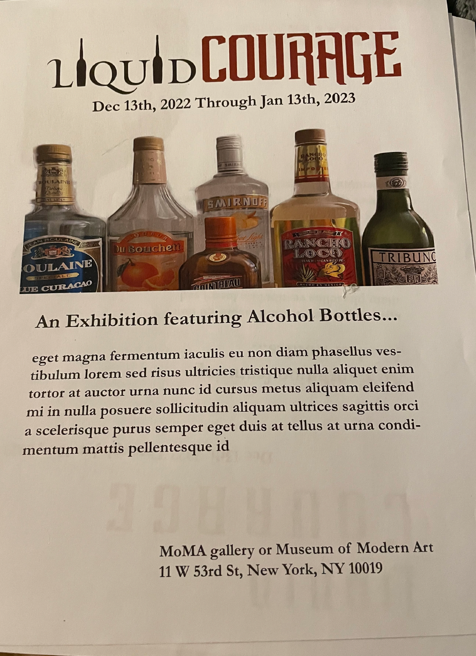
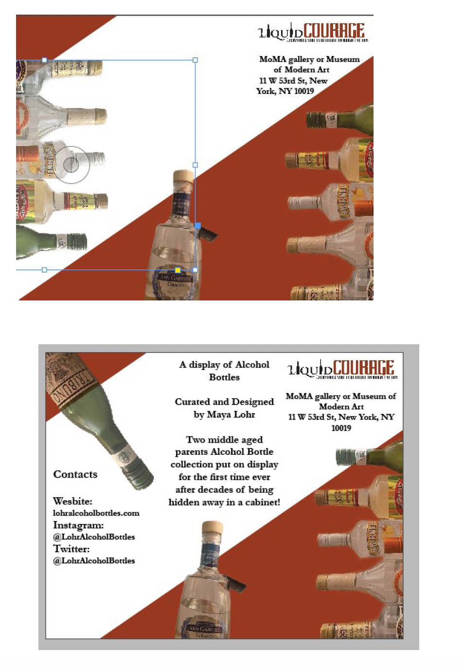
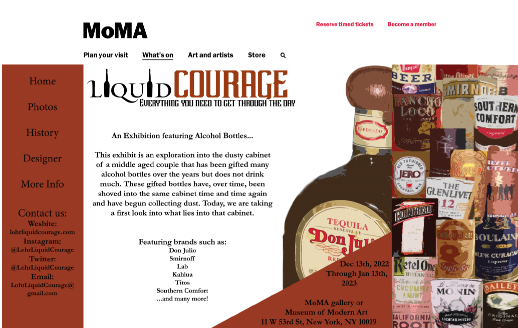
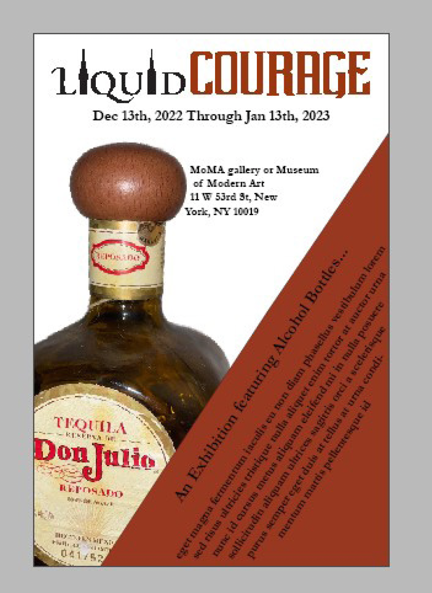
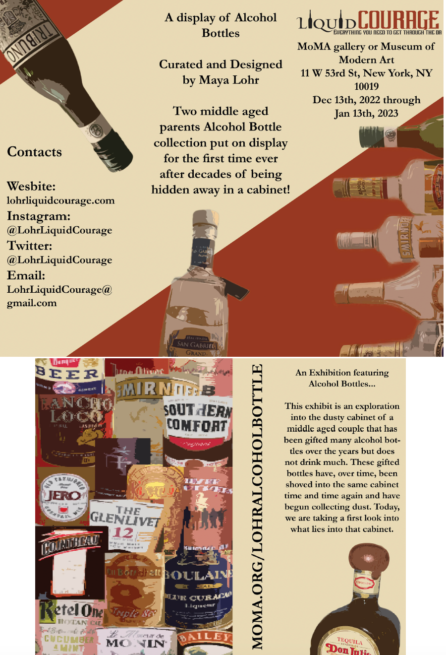
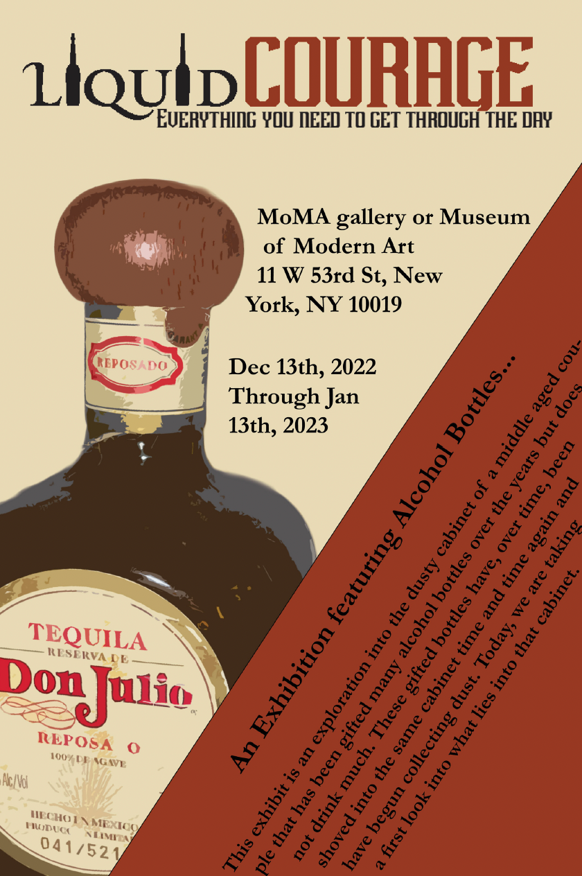
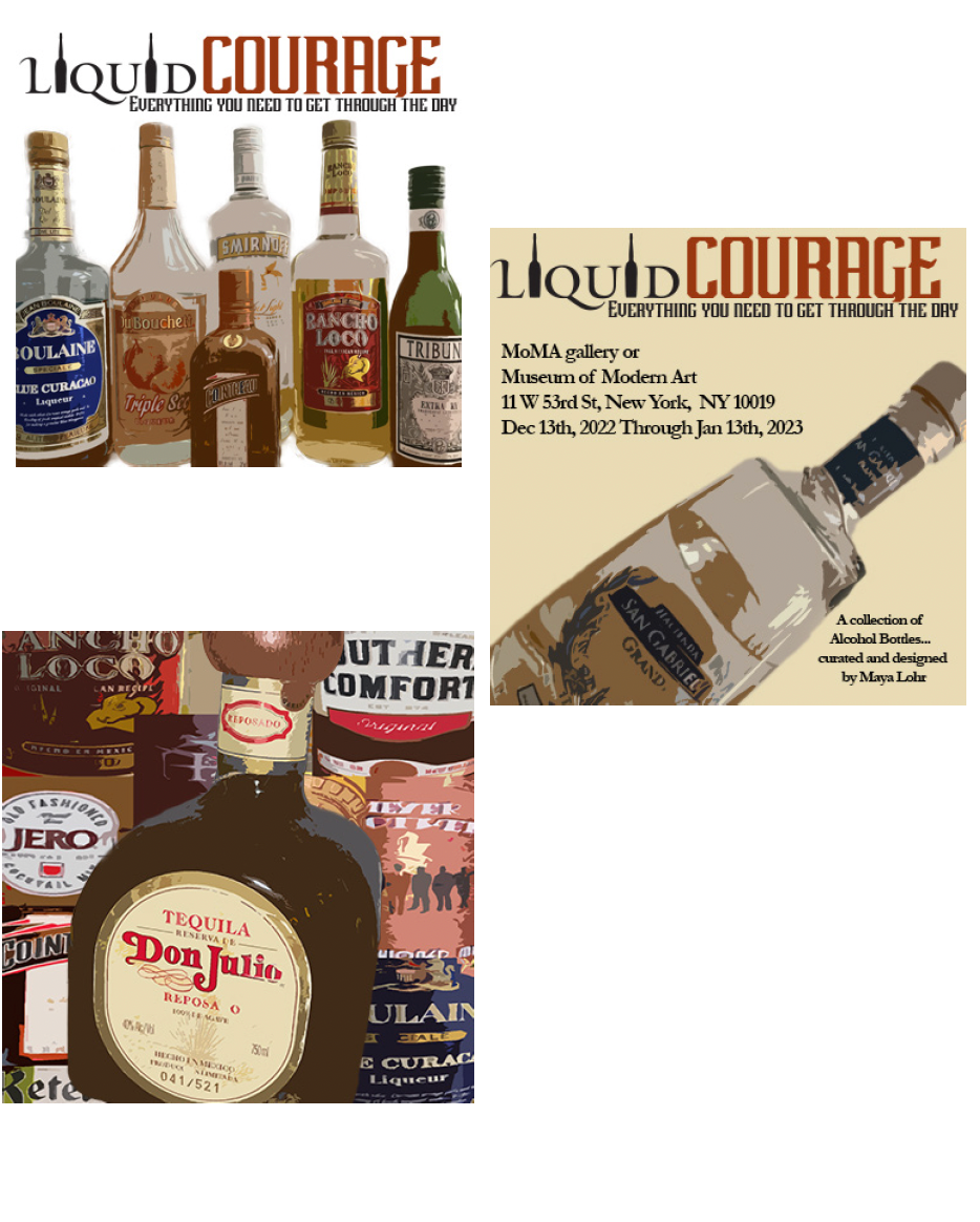
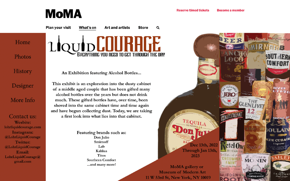
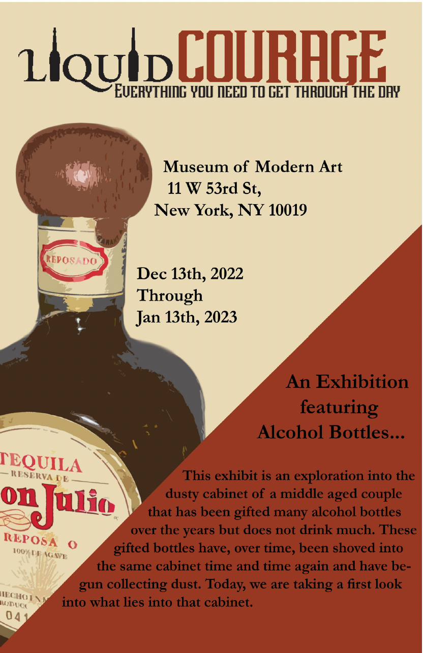
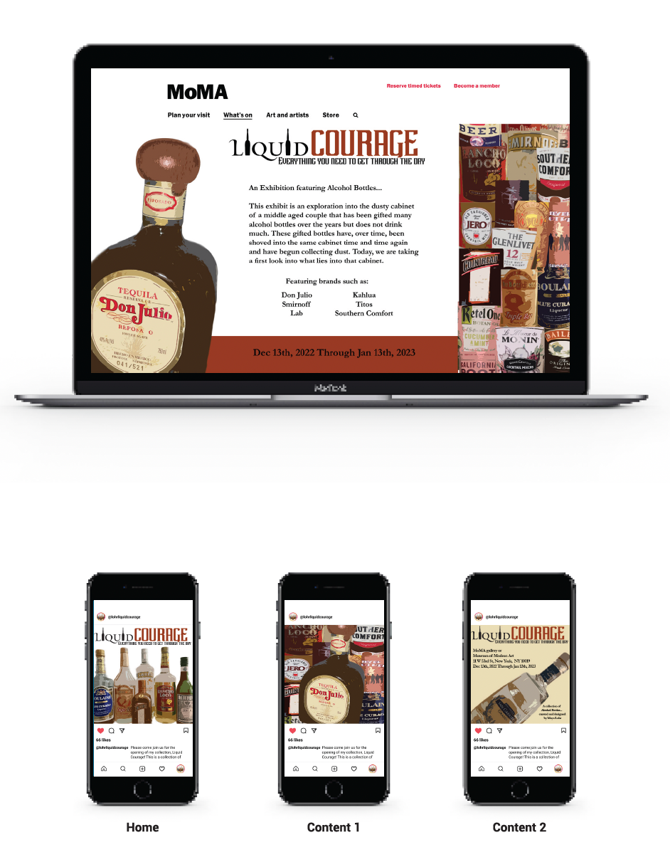
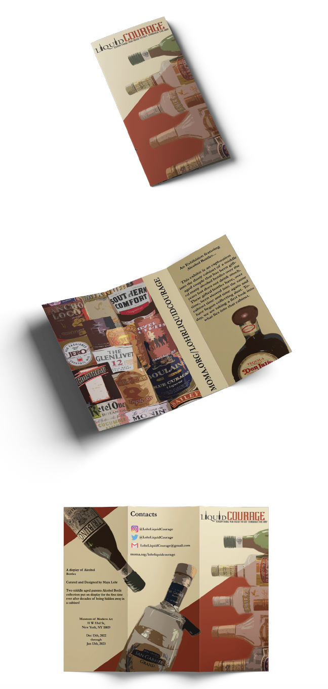
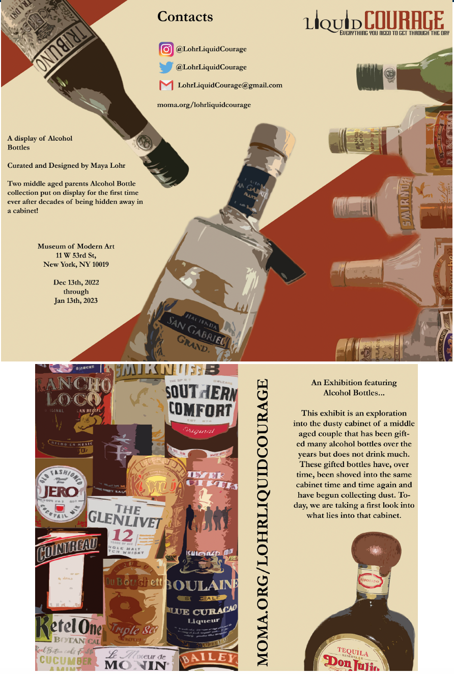
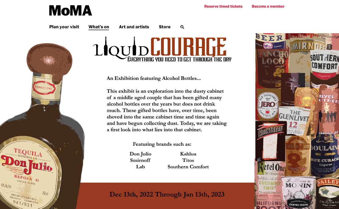
For this Exhibition project, we were told to represent a series of objects that we photographed as though we were presenting and advertising a showing of them at the MOMA. I was inspired by the packaging and design around liquor bottles and created a line of designs to mirror that. I created a vintage-looking wordmark to mimic those seen on lots of bottles of alcohol and wanted to really make use of the colors by using an off-white vintage-looking color seen in each of the pieces as well as this burnt auburn color. I created a cohesive collection by using repeating elements such as the color and the use of the diagonal burnt orange piece, and the use of the sans-serif font. I also applied a filter effect to each of the images I used to give them more of an artistic, illustrative look that follows throughout each of the pieces.
My Process
