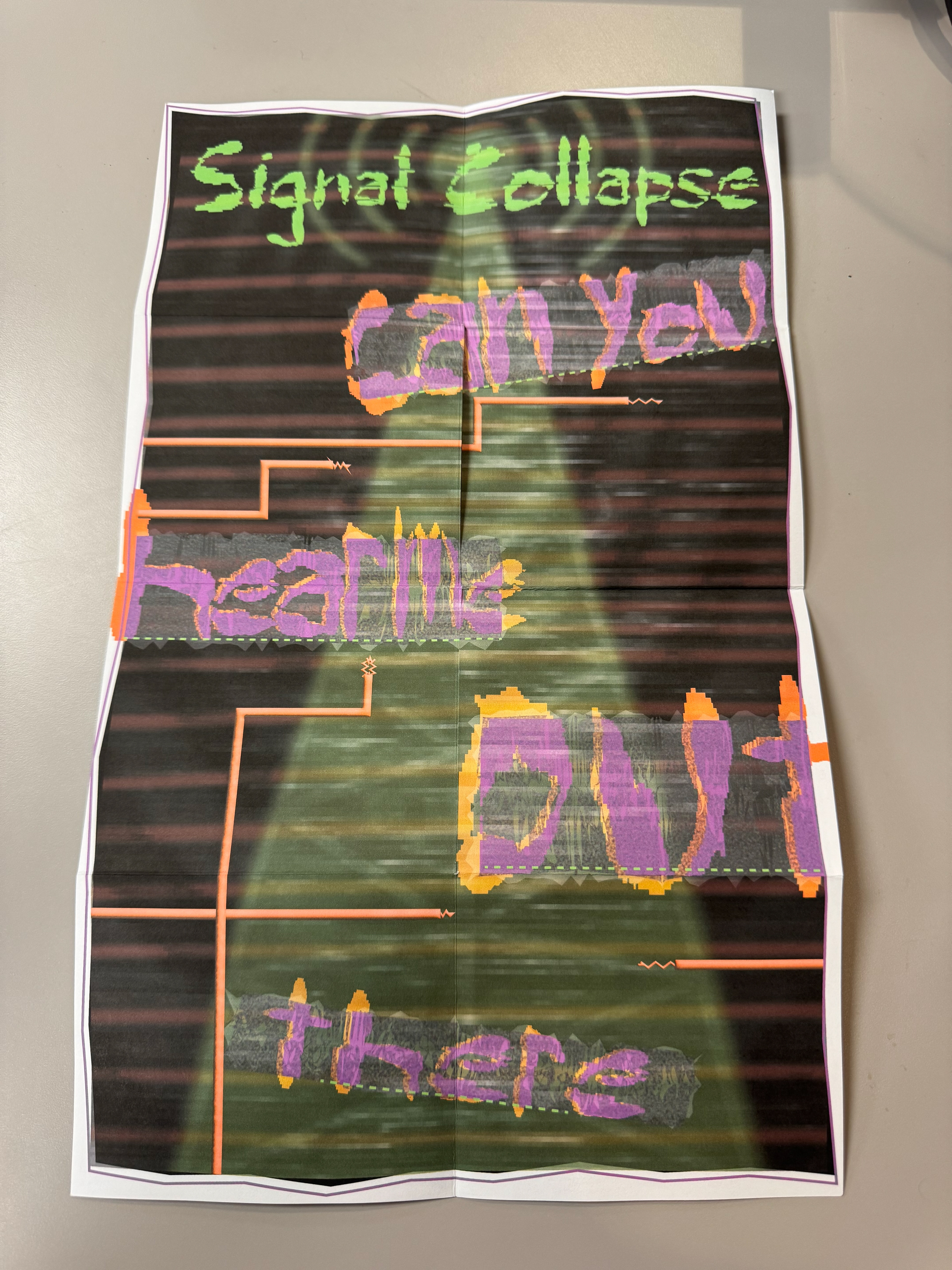
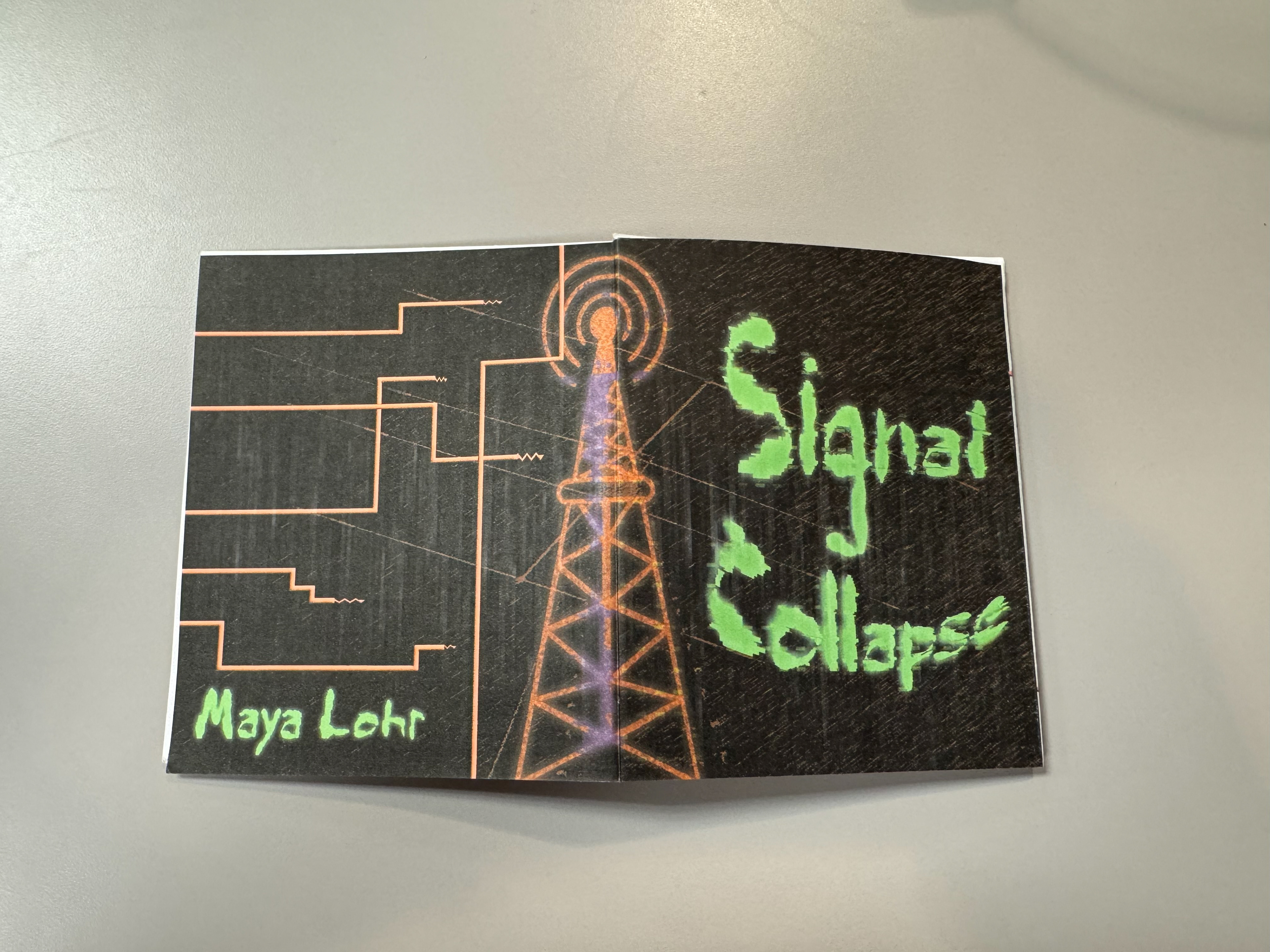
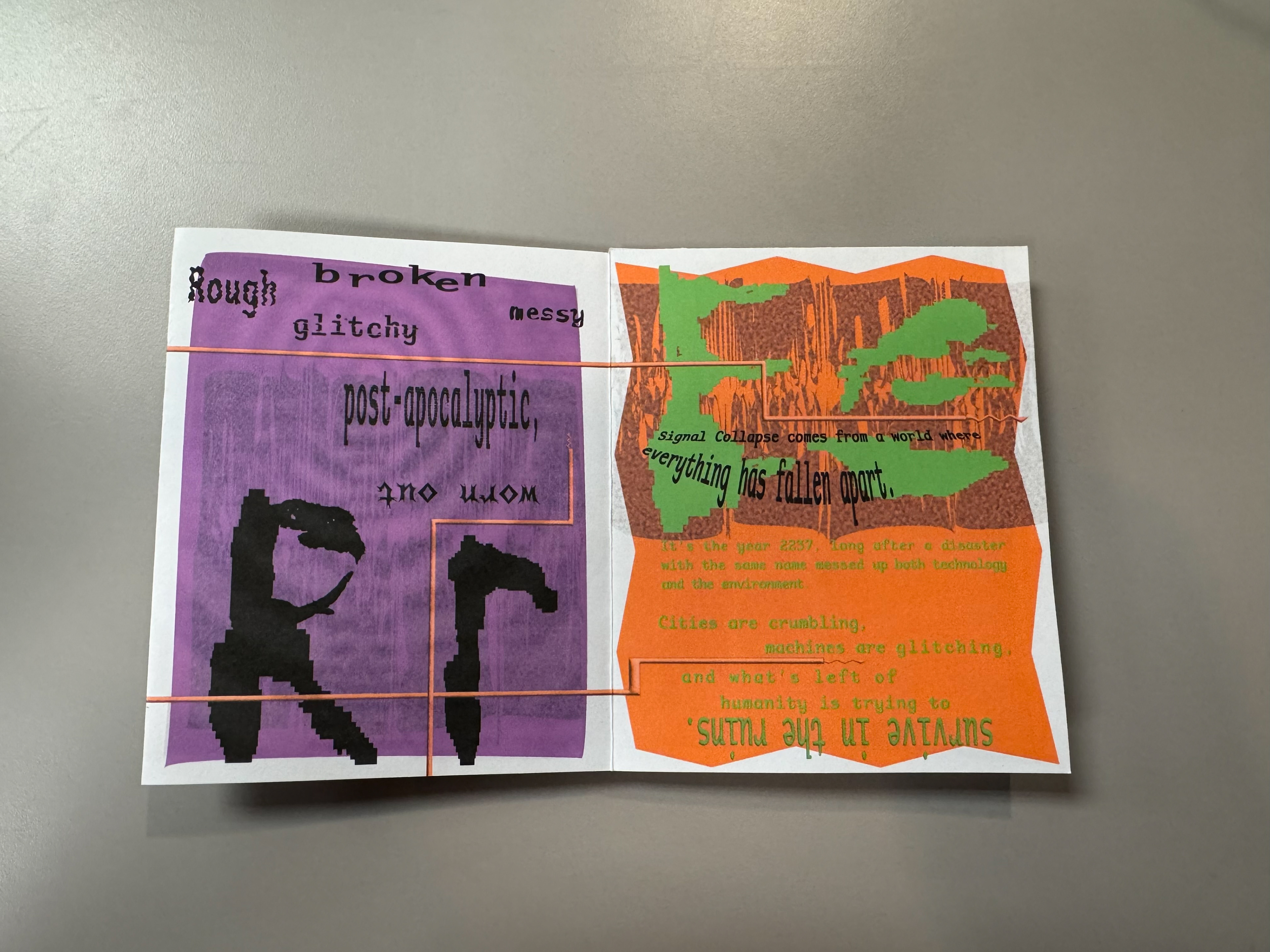
Signal Collapse comes from a world where everything has fallen apart. It’s the year 2237, long after a disaster with the same name messed up both technology and the environment. Cities are crumbling, machines are glitching, and what’s left of humanity is trying to survive in the ruins.
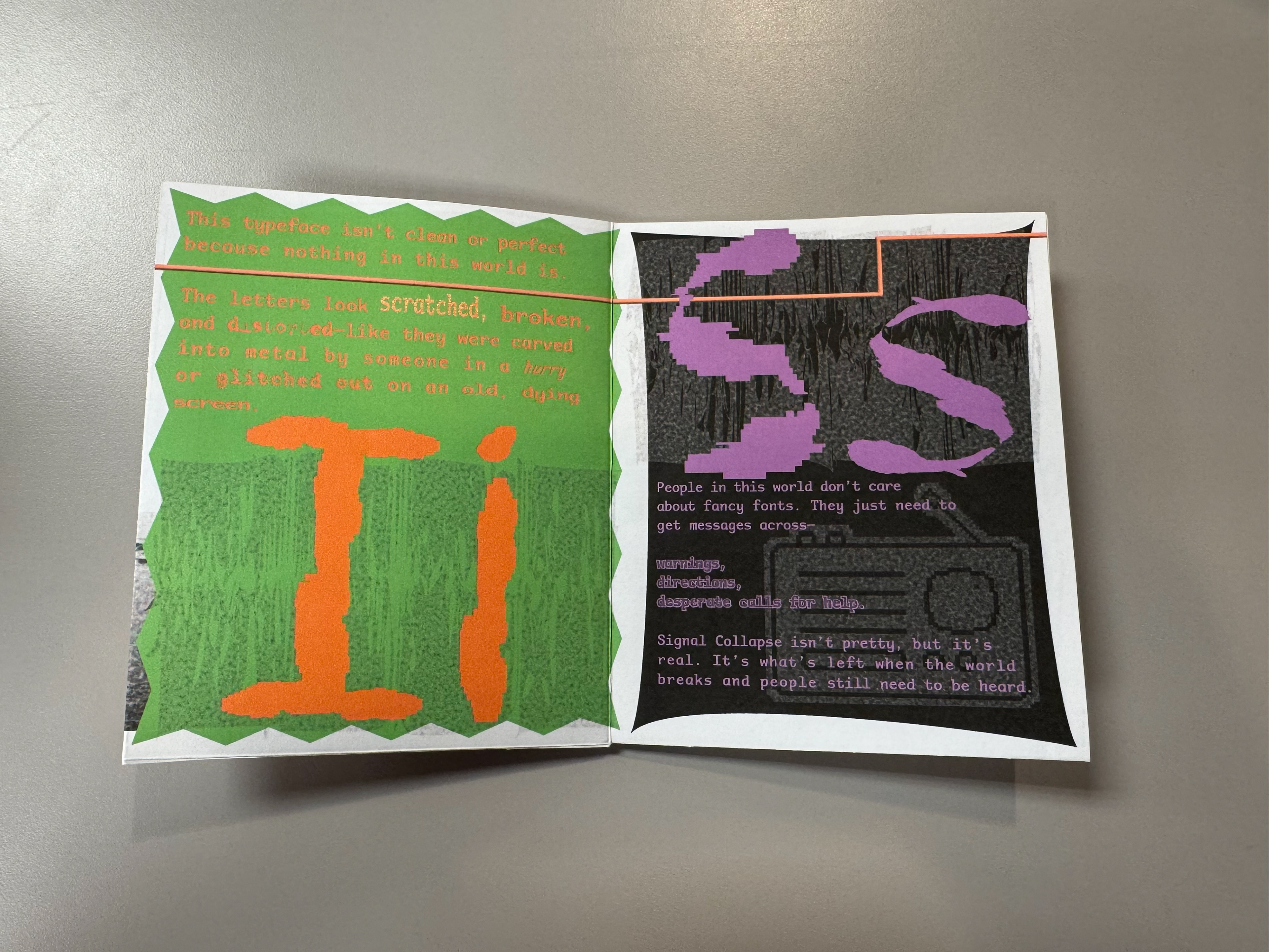
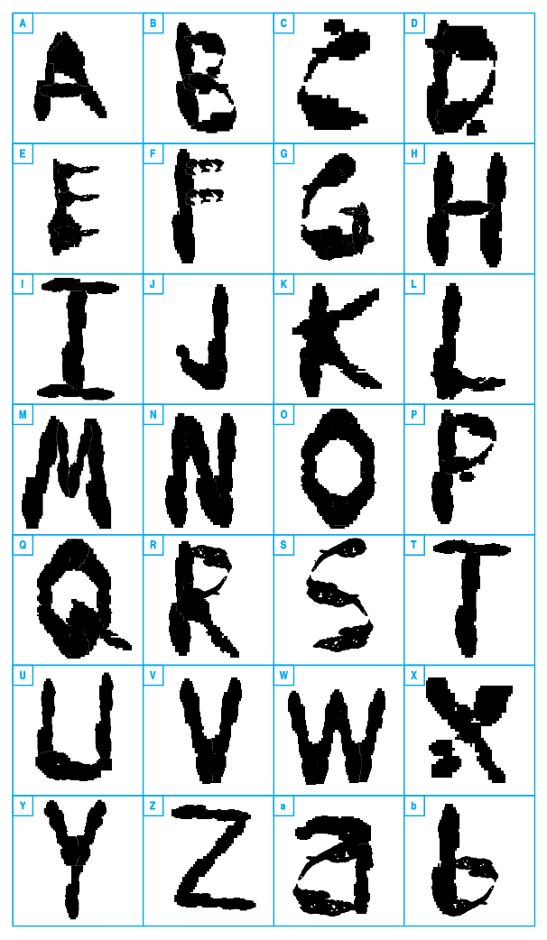
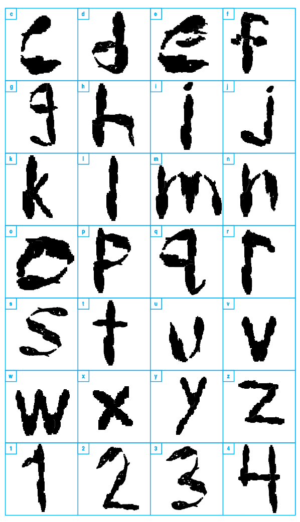
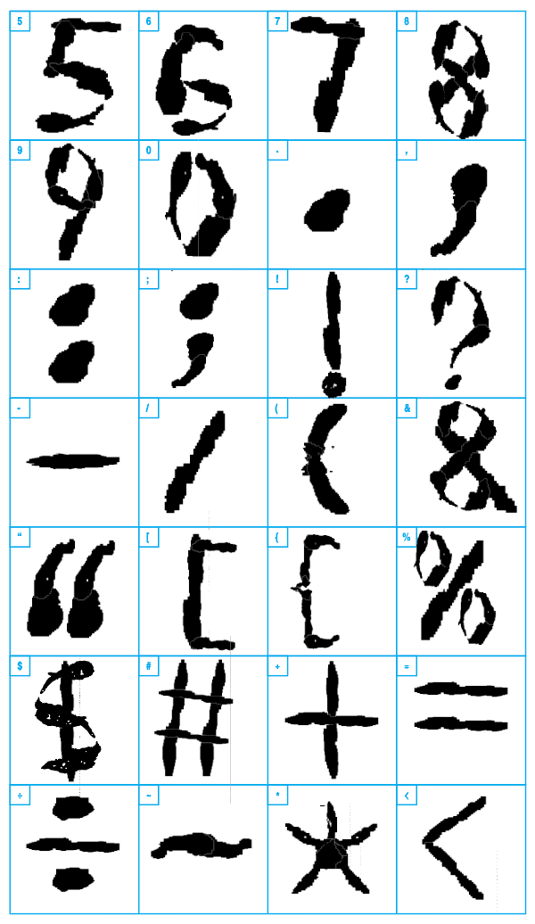
This typeface isn’t clean or perfect because nothing in this world is. The letters look scratched, broken, and distorted—like they were carved into metal by someone in a hurry or glitched out on an old, dying screen. Some letters are bulky and falling apart, while others are thin and jagged, like they’ve been worn down over time.
People in this world don’t care about fancy fonts. They just need to get messages across—warnings, directions, desperate calls for help. The rough, glitchy style fits the chaos around them. Signal Collapse isn’t pretty, but it’s real. It’s what’s left when the world breaks and people still need to be heard.
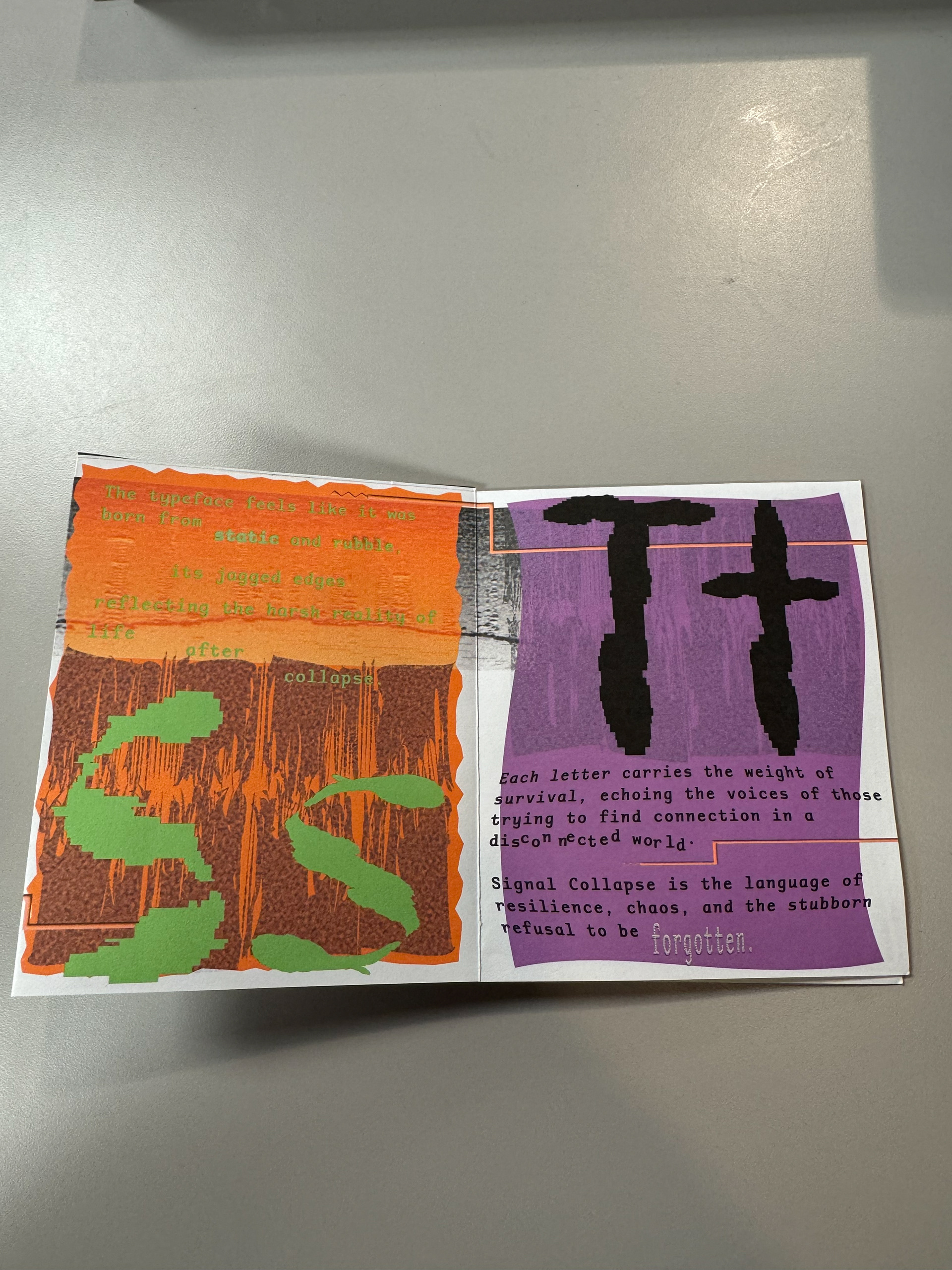
The typeface feels like it was born from static and rubble, its jagged edges reflecting the harsh reality of life after collapse. You might see it scratched onto rusted metal walls, flickering across half-broken screens, or painted hastily on tattered banners. Each letter carries the weight of survival, echoing the voices of those trying to find connection in a disconnected world. Signal Collapse is the language of resilience, chaos, and the stubborn refusal to be forgotten.
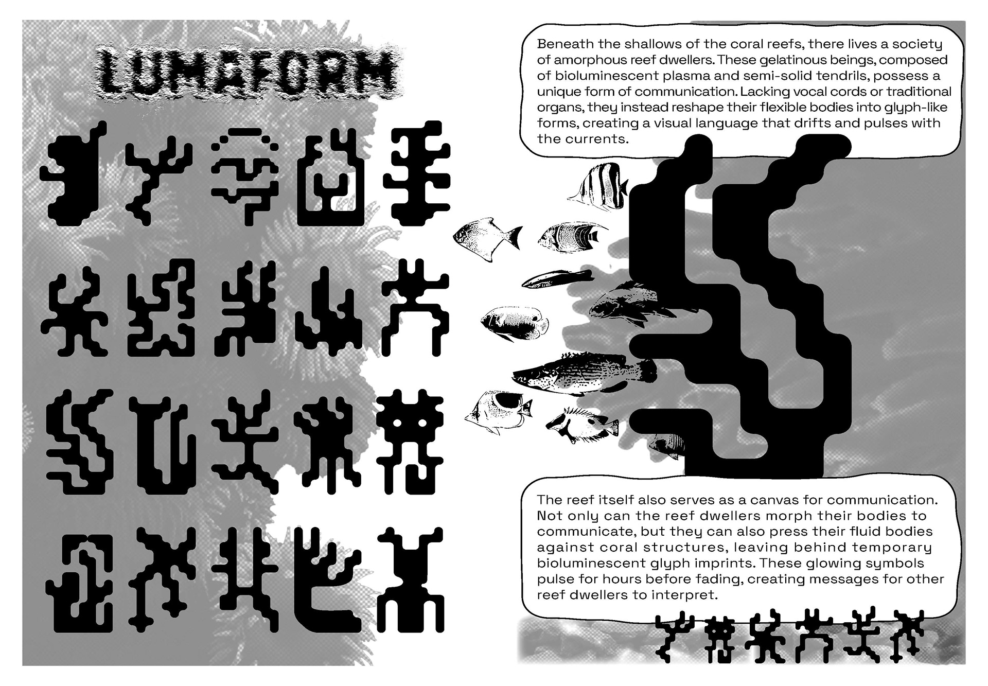
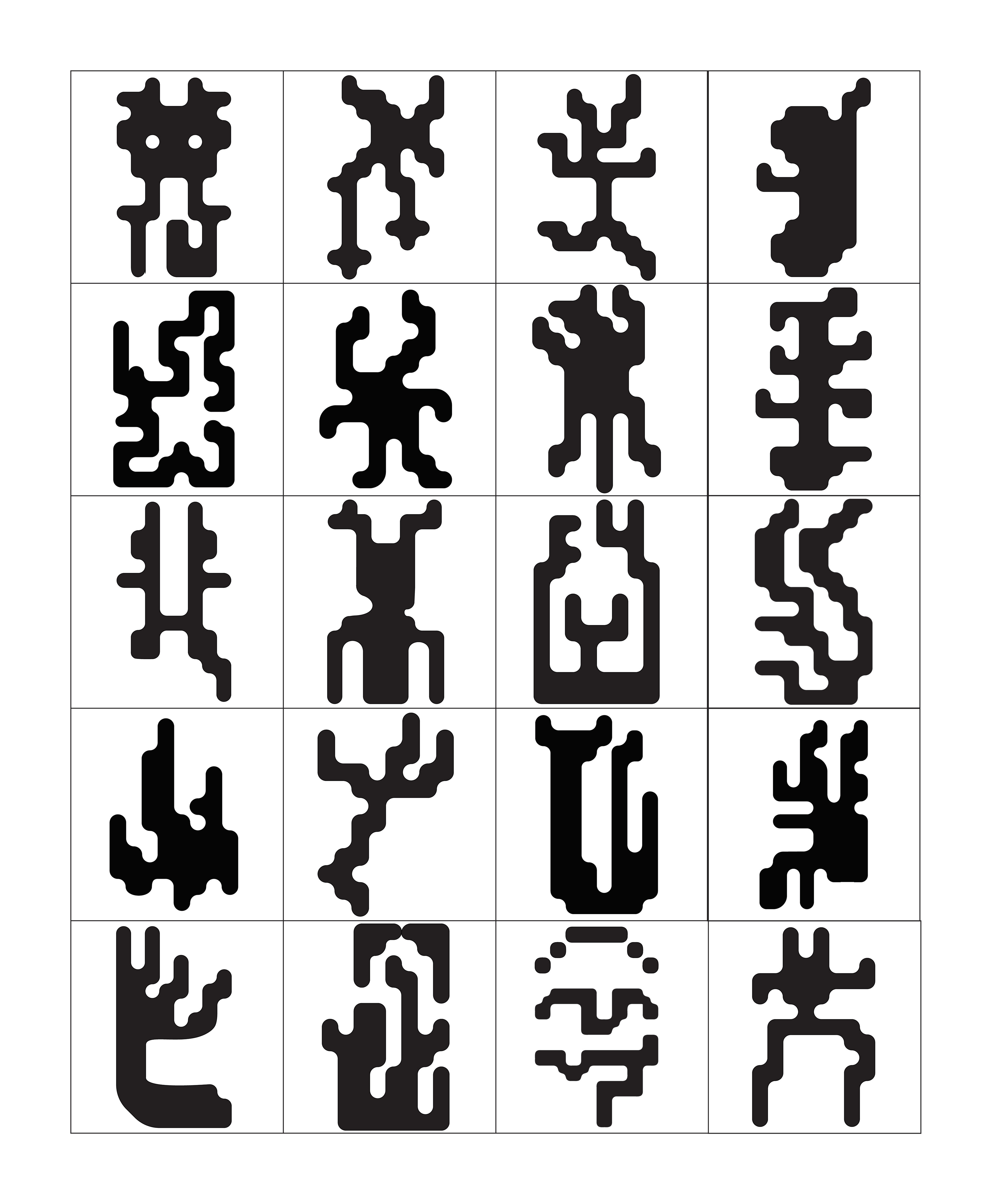
LUMAFORM
Lumaform is a custom, glyph-like typeface I created from analyzing the shapes of different coral shapes and structures within coral reefs, that I then developed a new origin for and story behind.
