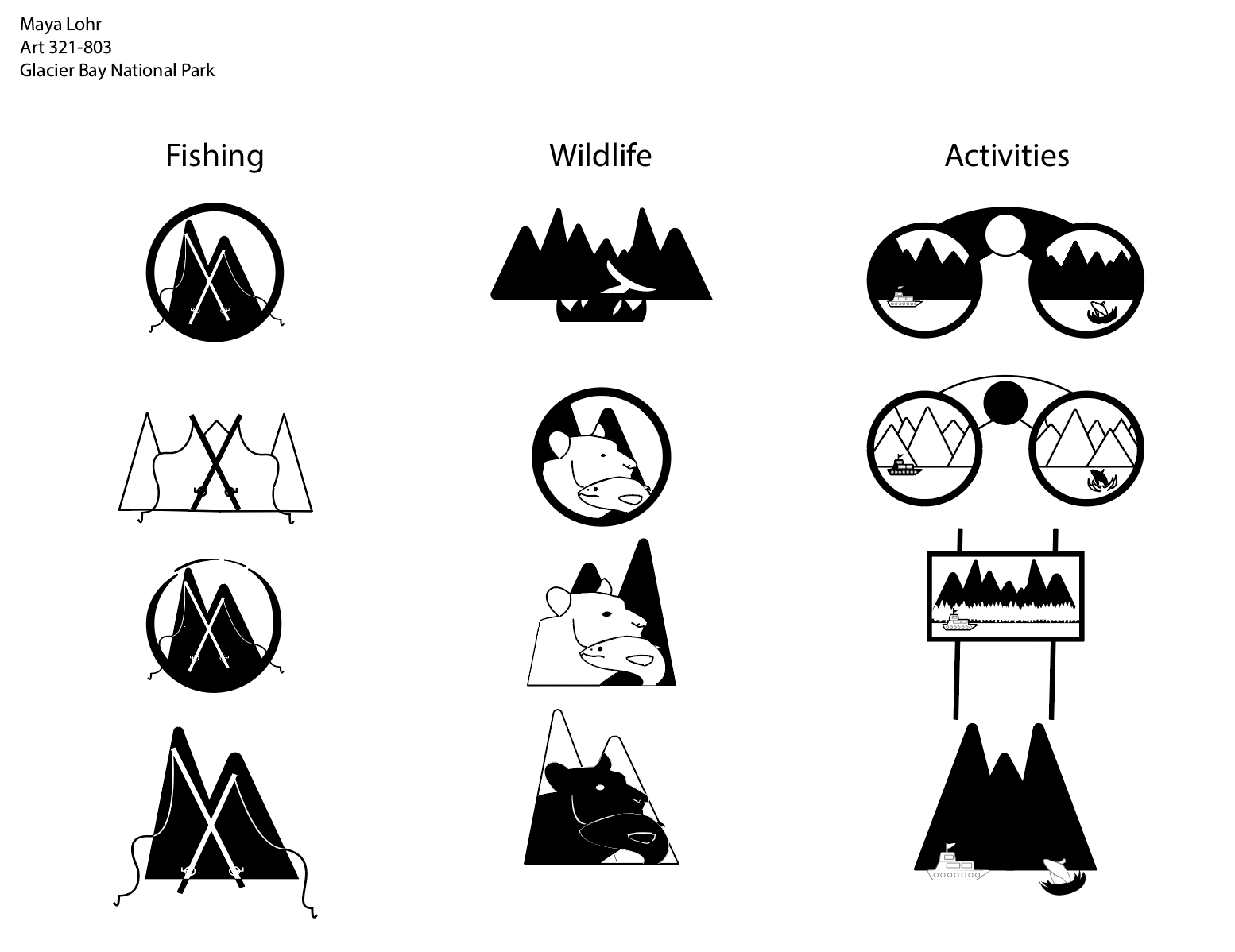
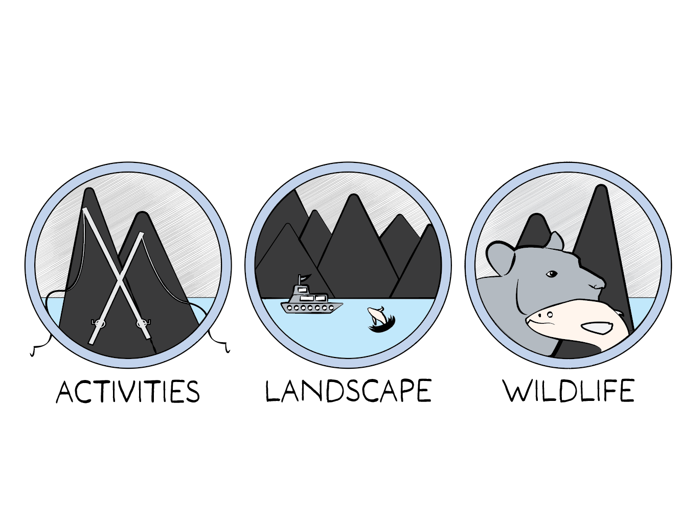
The challenge for this project was set to explore different strategies and methods to represent different, distinct aspects of a national park that I selected, which was Glacier Bay national park. We were tasked with creating a set of icons based on a few distinct keywords that represent our park and make it stand out from the rest. We were challenged to represent these keywords within iconographic imagery to draw tourists to the national park, while showing off important key aspects of it.
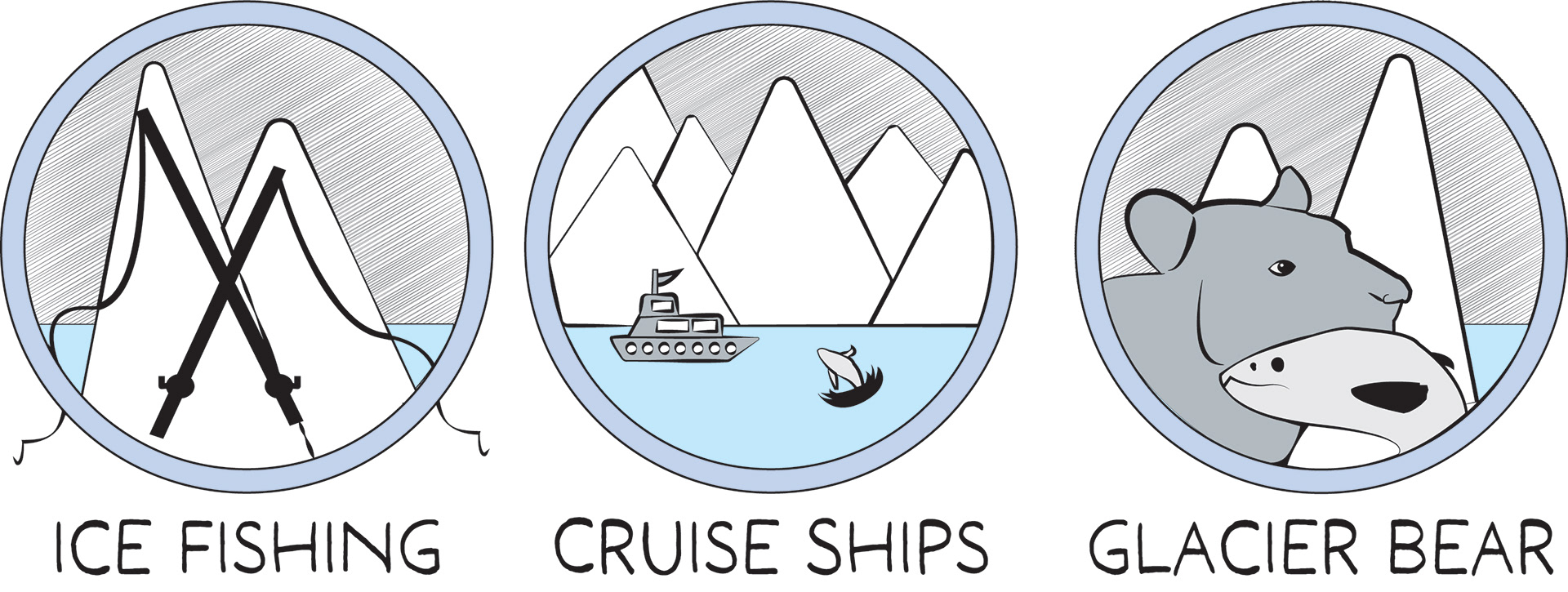
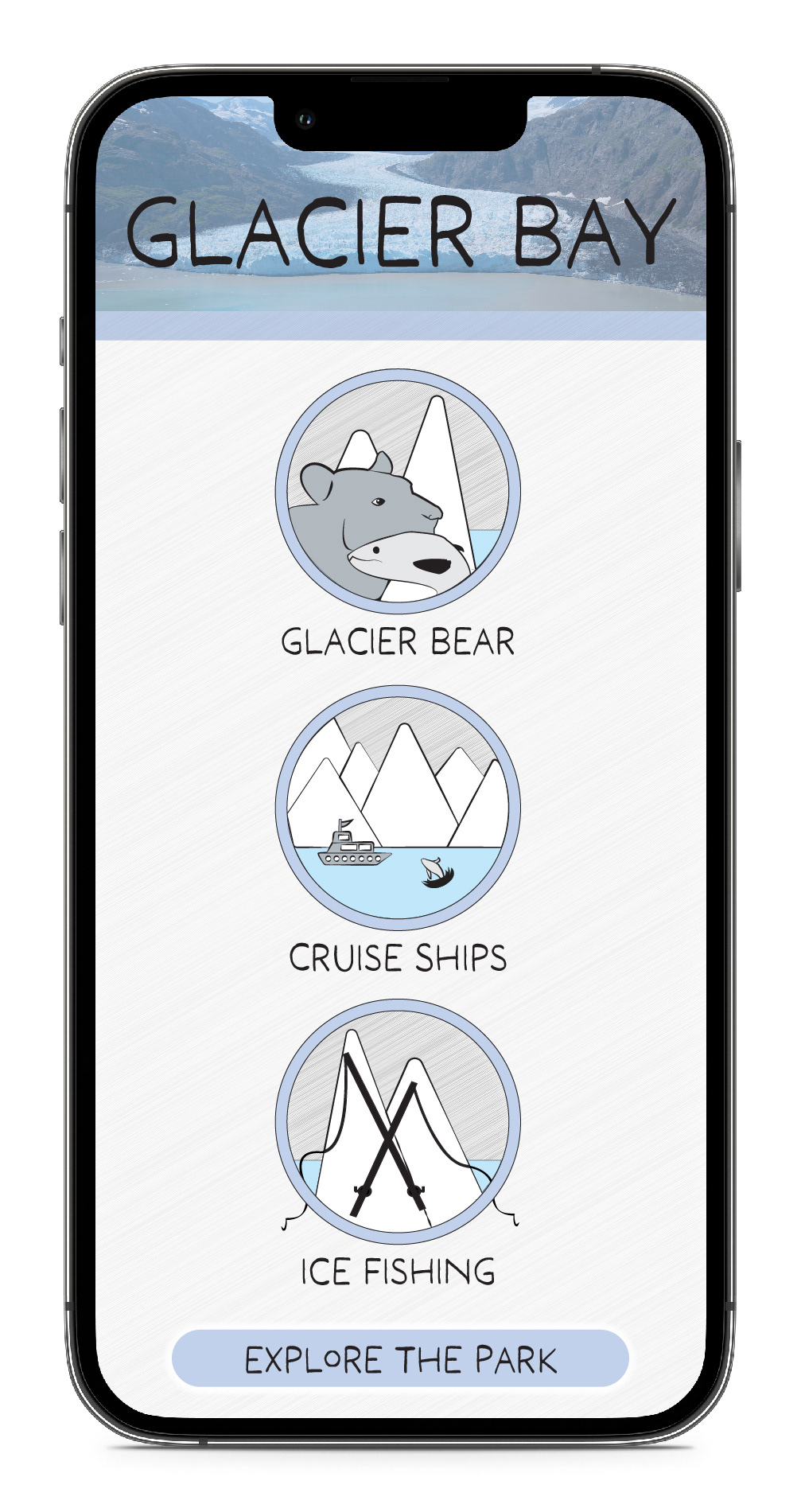
For this project, I opted to make use of Representative Imagery in my iconography, as well as a muted color scheme, soft curves, negative space, and a sketchy style, all to represent the organic aspects of the park, as a lot of it has been weathered away over time. I used imagery that represents the key parts of the landscape as well as the most popular activities people go to Glacier Bay to see and participate in, seen in the iconography of fishing and whale watching, as well as the Blue Glacier Bear, native to the park. These icons include lots of blues and whites to incorporate the colors of the snow and water in the park, as well as a large use of negative space to touch on the widespread landscape of vast bodies of water and mountains. All of this is done in a more artistic style with a variety of line weights as well as curved lines to lend to the idea of the park being weathered by the elements, and the lack of manmade items in the park lending to a less structured style of design.
My Process
