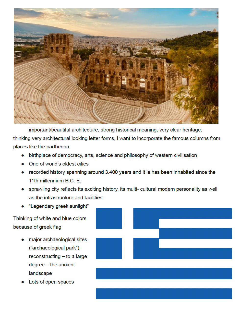
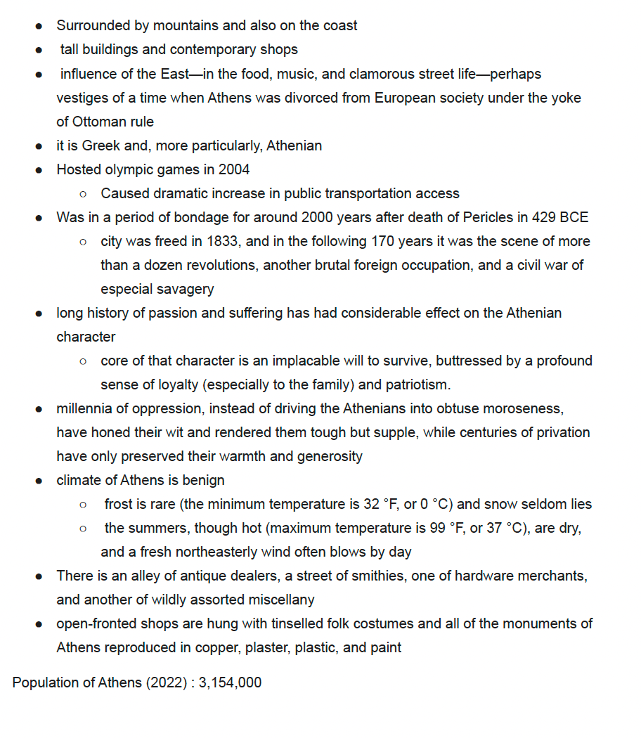
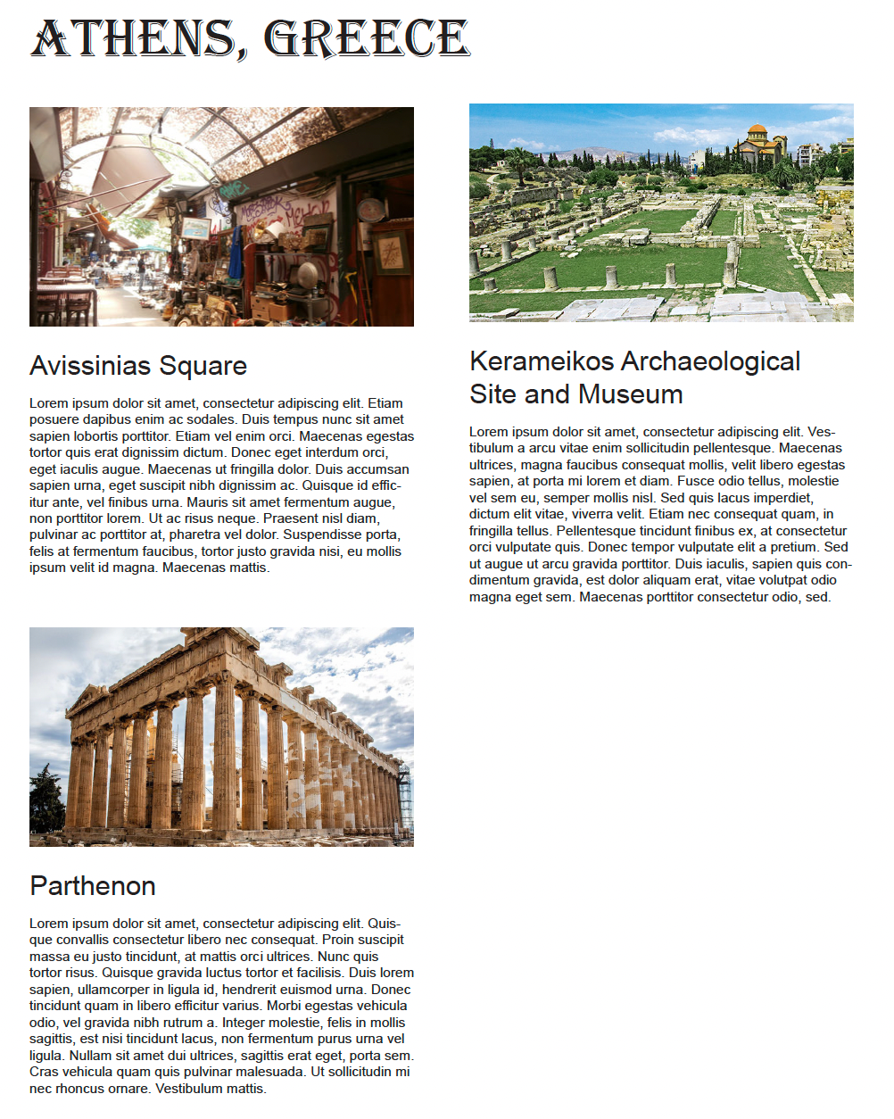
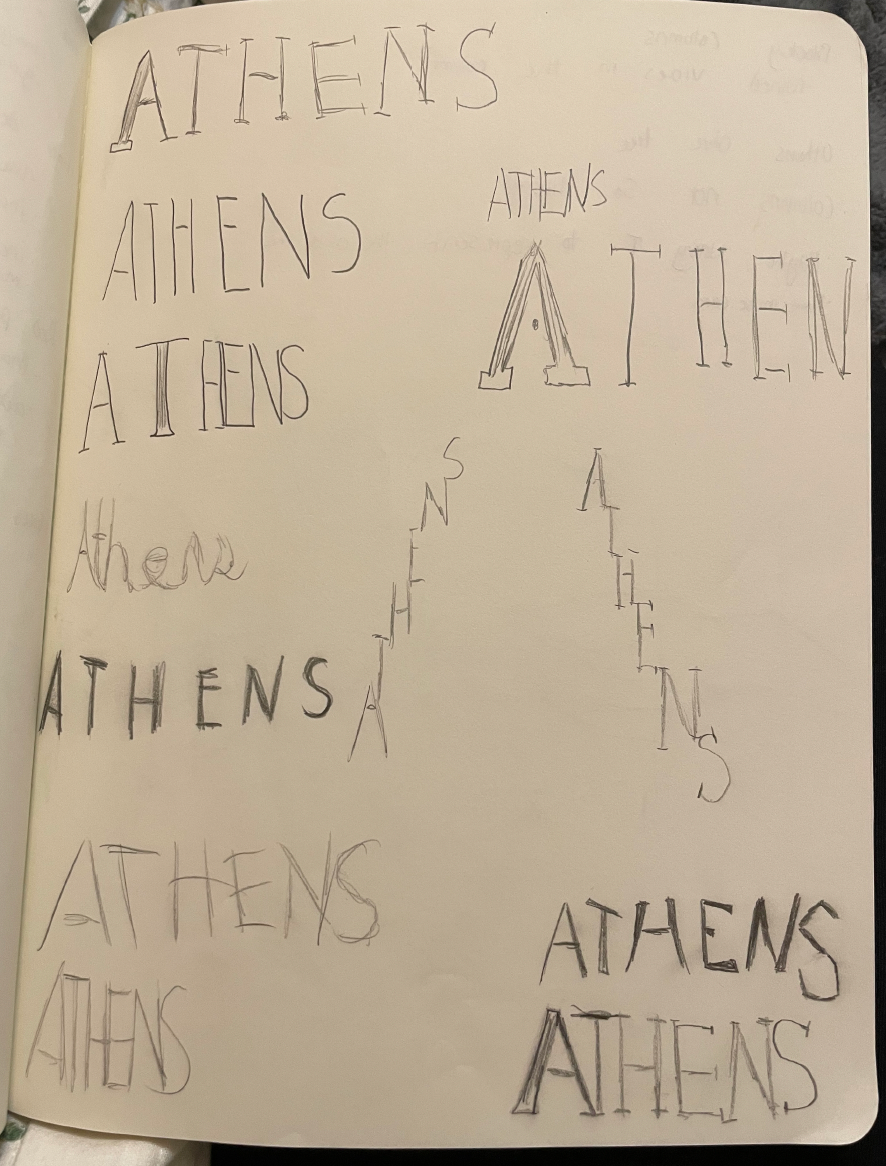
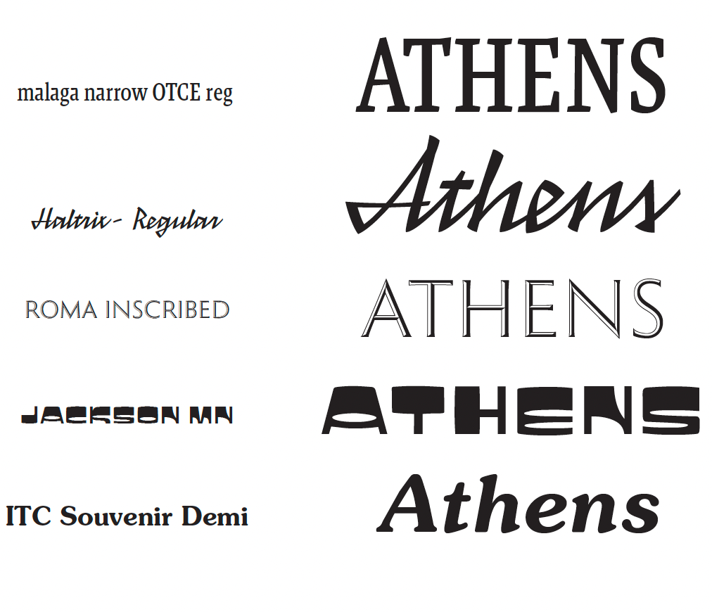
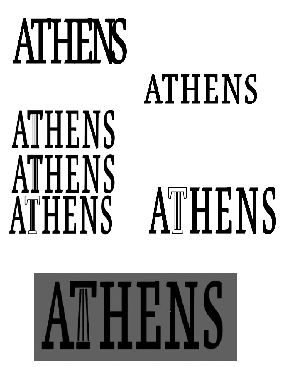
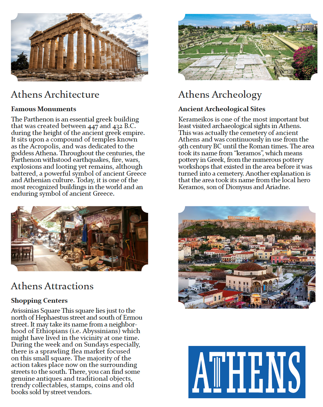
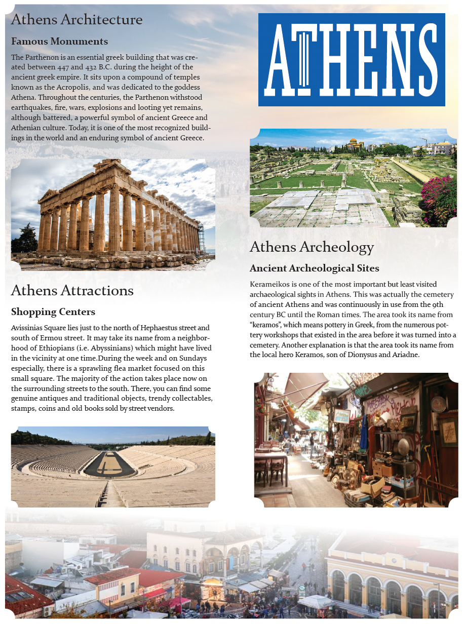
For this project, we had to take a place in the world and design a wordmark for it that represents its culture, and then use that wordmark in a brochure. For my wordmark, I wanted to really represent what makes Athens so famous, which is the Parthenon and overall ancient architecture that can be found there. I created a font that really represents the structure of the architecture and the bulkiness and sturdiness seen in the long-lasting buildings that can be found in Athens, manipulating the T to mimic those structures. I then chose a font that also reminds me of that for the brochure itself, and crafted the paragraphs into a specific format to go along with the pictures and information, adding a gradient background with carved corners to support the ideas in the brochure.
My Process
